The pie's the limit
We are Colorblind is a growing collection of patterns and tools to help designers, developers and others create websites that are accessible to those who are color blind.
The main takeaway is to use something other than color to convey information.
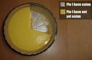
I suspect there will be a few people who would like the pie chart pattern to stress that pie charts can often difficult to read whether you are color blind or not, and should often be replaced by a bar graph or another way of conveying the same information. Unless, of course, you're using the pie chart to make one point or to show how much pie you've eaten.
Joking aside, the Google Analytics example used in We are Colorblind could be replaced with a bar graph:

One possible alternative to the Google Analytics pie chart.
(I discovered We are Colorblind via swiss miss)
Update: I've just had an email from Tom van Beveren, who runs We are Colorblind. He'll be updating the pie chart pattern to suggest that alternatives to pie charts be considered.
**Update 2:**Tom tweeted earlier today that he's updated the pie chart pattern with my suggestion. Thanks Tom!